Detailed Catalog Page Redesign
Groupe Park Avenue, 2019
Overview
Product Vision
As a multibrand automotive consortium, GPA wishes to implement a tool which compares variants of the same model or different models while providing realistic payment estimations connected in real time with the manufacturers’ monthly incentive programs.
User Problem
Shoppers in search of a new vehicle have a good idea of the makes and models they are interested in, and are looking to compare dealership offers in order to identify the product variant that best matches their criteria.
Outcome
We proposed to redesign the Catalogue Detail Page to simplify the comparison process and to offer more transparency and customization around payment estimations.
Team
UX/UI Designer (me)
Web Development Agency
Marketing Director
My Tasks
Project Management
User Research
Ideation
Prototyping
Project Plan
Two days for discovery and ideation
Two days for prototyping
Discovery
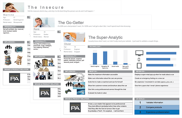
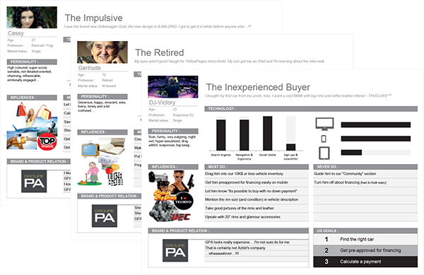
Personas
User Test
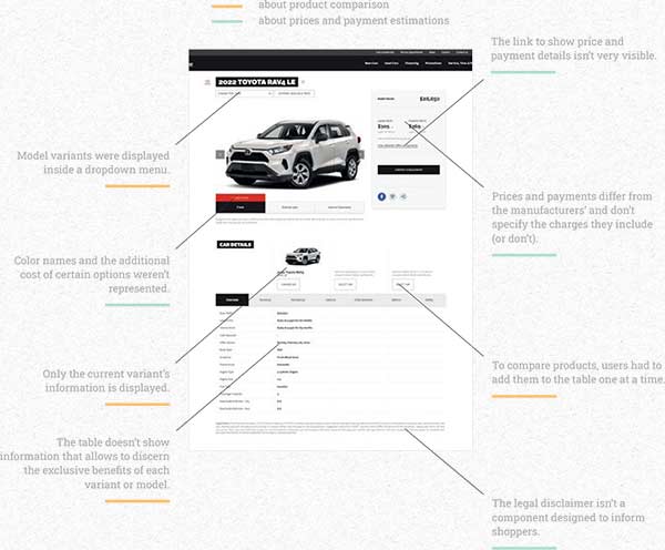
Many users have shown difficulties accomplishing the tasks they wished to complete.
- GPA’s current tools weren't very useful for comparing product offers.
- Prices and payment estimations aren’t clear regarding the charges included in the final price and payments.
Heuristic Evaluation
The team observed a few pitfalls in the user journey during the exercice.

Ideation
Sketches
A data table comparing all variants of a model would offer a good place to start to help car shoppers find a product.
How could we make the already existing table more efficient while composing with the interactive content that is already offered?

-
Thanks to the table, all data is easily comparable.
-
Enlarged the area allocated to images and interactive contents.
-
Added a Calculator button next to each payment.
-
Table difficult to adapt on small devices when variants overflow the allocated space.
-
Unable to distinguish product features at a glance.
-
The page feels bland.

-
Image of the product in action brings a better product experience.
-
Added product highlights to compare and differenciate variant features easier.
-
Call-to-action buttons are very visible.
-
Payment customization bar discourages the use of the calculator.
-
Despite the addition of buttons, table is still difficult to adapt to small screens.
-
Table shows too much irrelevant information.

-
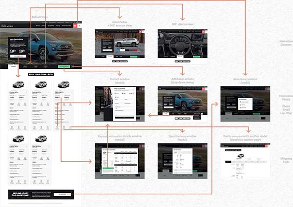
Transformed the table into a cards list, a compact and versatile format suitable to any number of variants and screen sizes.
-
Cards show each variant’s main features to allow an easy understanding of the differences between each product.
-
Added the product’s position on the market to tell more about the customers it targets.
-
Depending on the amount of data, cards could take a while to scroll on mobile since showing them in columns is impossible.
Outcome
Product Comparison
The sum of all changes provides users the tools they need to understand each product’s main features in order to choose the one that best matches their needs.
-
Displaying variant information in cards allow users to visualize each product separately and distinguish their features while allowing the flexibility we need to display this information on any screen size.
-
Moving technical specifications to a modal window made room for more significant content.
-
Images breathe life into the content while enlarged photos bring users closer to the product.
-
Depending on the amount of data, cards could take a while to scroll on mobile since showing them in columns is impossible.
-
Comparing a variant to another model is still possible but the functionality is now secondary.
Prices & Payment Information
The changes we proposed provide users additional information to learn more about the prices and numbers they see.
-
The addition of a table listing the charges included in the product’s final price provides more clarity and transparency.
-
The addition of Calculator buttons next to payments incite users to interact with the payment estimation tool.
-
The addition of color prices allow users to better understand the impact of colour choices on the final price.
-
Many more options have a bigger impact on the final vehicle price. The changes needed to integrate this content go past the scope of this project but offer a path for further development.
Estimated Impacts
The COVID-19 pandemic forced the company to shift priorities and end the project. However, we are able to provide an estimate of the impacts proposed by the redesign process.
-
Increase in user engagement.
-
Choosing a product that matches all criteria would have been easier.
-
Better understanding of the charges included in the products’ final prices.
-
More interaction with the payment estimation tool.
-
Increase in customer trust towards the company.


