
Marketplace Design
Groupe Park Avenue, 2015
Overview
Product Vision
As a multibrand automotive consortium, GPA possesses a large inventory of new and pre-owned vehicles and wishes to make them easily accessible through their online marketplace.
User Problem
After determining a few makes and models that interest them, car shoppers look for a dealership to do business with by browsing their catalogues and inventories online.
Outcome
The content structure and user interface were designed around the micro-moments car shoppers meet during their process in order to facilitate their search of a vehicle and the first contact with a dealership.
Team
UX/UI Designer (me)
Web Design Agency
Web Development Agency
Digital Strategies Director
My Tasks
Content Structure
User Journey
Wireframes Approval
Project Plan
Three months for content and visual design
Six months for development
Discovery
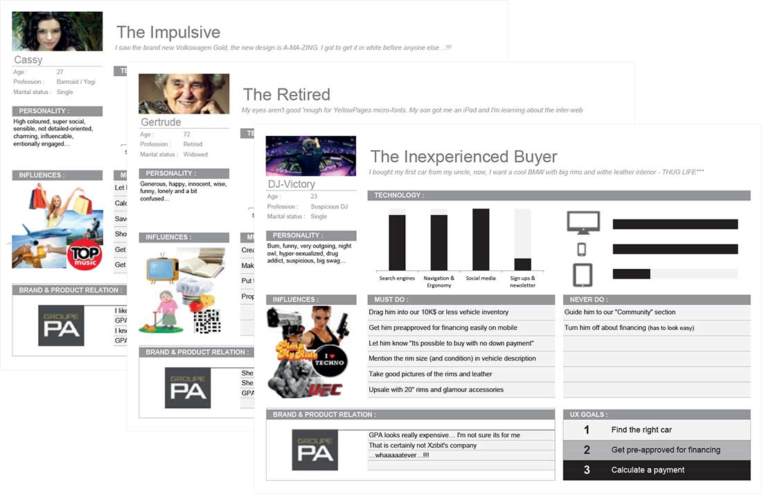
Personas

Competition Analysis
The users' journey is roughly the same everywhere we looked.

About Online Car Shopping
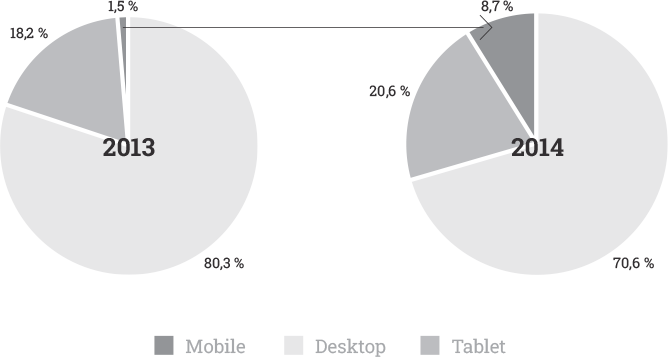
In 2014, the proportion of mobile users on the website jumped considerably. In 2022, they represent 40% of website traffic.
2013 vs 2014
Car shoppers can search online from anywhere, anytime, creating a plethora of micro-moments to benefit from.
- Micro-moments
- An intent-rich moment when a person turns to a device to act on a need — to know, go, do, or buy.
New Challenges for Car Dealerships
- Product catalogues and inventories must be easily accessible at all times via online search engines.
- The website experience must be optimized for all types of devices, smartphones in particular.
Ideation
Strategy
- Create pages designed for micro-moments that target keywords used by car shoppers in search engines.
- Adopt a mobile-first approach during visual design.
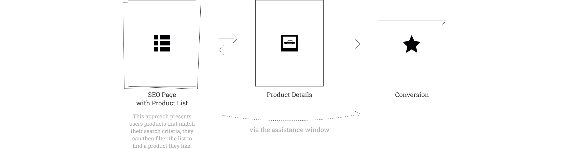
- Present a list of products that match the keywords in order to accelerate the users' journey to a Product Detail page.
Step 1: Identifying Search Trends
| Keyword Categories | Monthly Volume (QC) | Examples |
|---|---|---|
| Make | 16,000 |
audi for sale
new audi used audi |
| Make + Model | 70,000+++ |
audi a4
new audi a4 used audi a4 audi a4 for sale |
| Year + Make + Model | 12,000++ |
2014 audi a4
2011 audi a4 2014 audi a4 for sale 2011 audi a4 for sale |
| Make + City/region | 35,000 |
audi brossard
audi montreal audi south shore |
| Category | 6,250 |
pickup truck for sale
suv for sale cabriolet for sale |
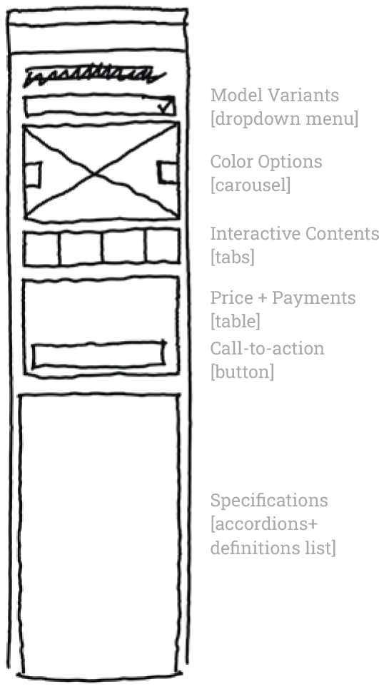
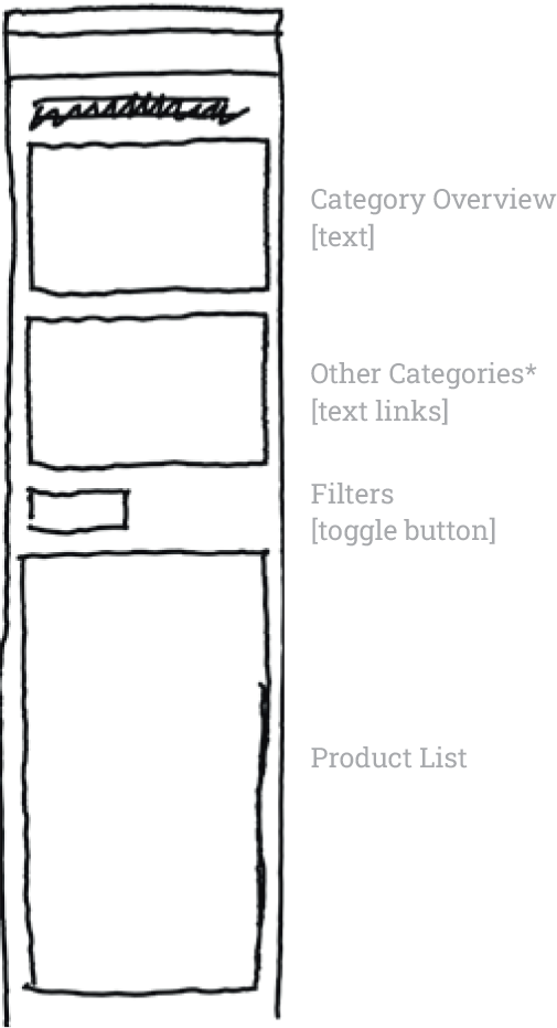
Step 2: Visual Page Design
The website’s visual design process was already in an advanced stage, therefore we had the essential components we need to design our templates.
-
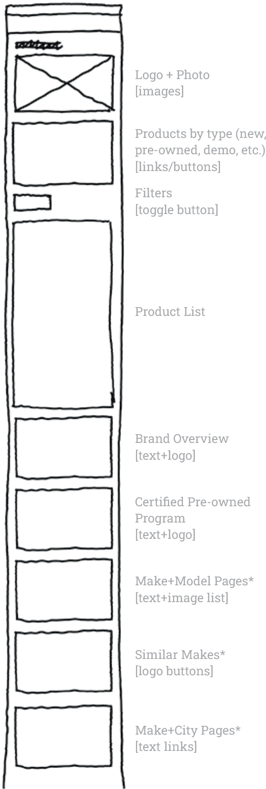
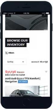
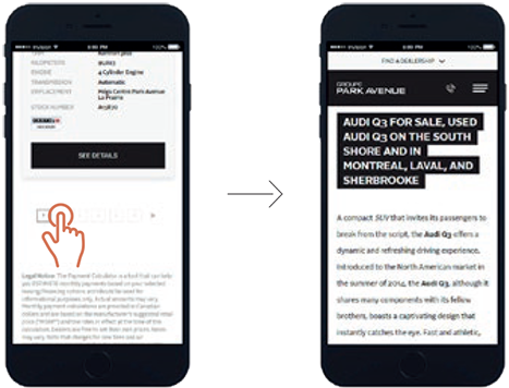
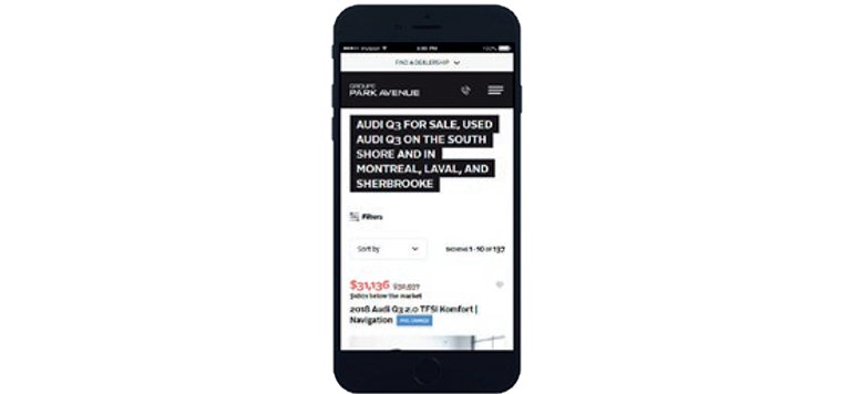
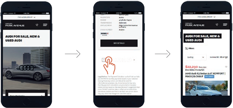
Each page header is designed to present the type of product that users will find and to facilitate information indexation by search engines.
-
The ‘Filters’ toggle button shortens the page length and gets users to the product list faster.
-
The site’s navigation menu remains available if the contents don’t match the users’ expectations.
-
Users could miss the ‘Filters’ toggle button due to the amount of contents in the surroundings.
Prototype
Mock-ups


User Journey
Problems on the Horizon
After launch, we detected disappointing engagement statistics. A heuristic evaluation brought a few roadblocks to the surface.
Solutions
Outcome
Search Engine Optimization Strategy
The website’s content structure design allows it to occupy a leading position in the online search results of thousands of potential customers.
-
The website presents users relevant content that matches their search intent as soon as they land.
-
The user journey is shortened and simplified.
-
The optimization around precise long-tail keywords targets car shoppers in the middle of their process.
-
Some pages will show an empty list if no vehicle match the search.
-
Users might find that the texts written for search engines in 2013 are deprecated.
Mobile-First Approach
The team made sure that each step of the journey presents a positive experience despite the constraints.
-
The most commonly used functions are visible and large enough for fingers.
-
Access to product lists is fast.
-
The page header is hidden to eliminate a redundancy effect when users go from one page to another.
-
The team hasn’t designed for a small enough screen resolution: certain components are not optimal when the screen width is below 375px.
Impacts
Designing the content structure of the website around the micro-moments users meet during the car shopping process guarantees a simple and enjoyable experience to GPA customers.
-
Search engines traffic increased dramatically:
- 2015: ~3,000 sessions /month
- 2017: ~16,000 sessions /month (+432%)
- 2022: ~34,000 sessions /month (+1,147%)
-
Mobile users statistics have improved:
- Bounce rate: Decreased by 29%
- Pages /session: Increased by 63%
- Average session duration: Increased by 11%
- Conversion rate: Increased by 446%
-
The strategy continues to generate traffic and profits long after its implementation.
-
Pages were crafted and configured manually, one by one; the implementation has been a long process, with certain steps occurring after launch.
-
The strategy requires monitoring in order to further optimize and not lose the gains.